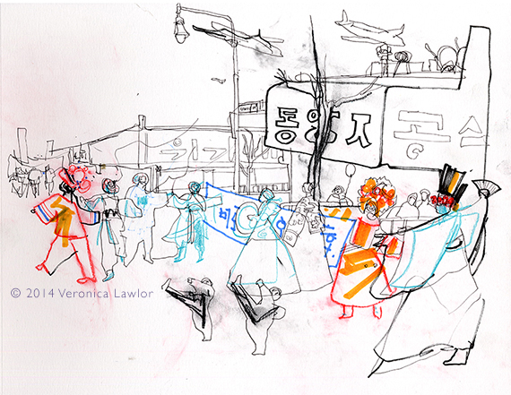
 This past Saturday morning, despite the FREEZING weather, I decided to go over to Main Street in Flushing, Queens, and draw the lunar new year parade. There were two distinct sections to the parade: one was Chinese and the other was Korean. It was so interesting to see the differences, graphically, between the two cultures. The Chinese section of the parade was very gold and red and super decorative, with swirling dragons and lions – very Art Nouveau. The Korean section was mainly blues and white, and very geometric – large angular shapes and over-sized details. Kind of Constructivist in feeling. The amazing thing to me is that the Chinese and Korean calligraphy shows similar differences. Guess you can’t ignore culture!
You can see more drawings from the parade here, and see if you agree with my assessment of the two cultural graphic styles!
posted by Veronica
PS How cute are the little guys practicing their Taekwondo in the parade? What energy – they were kicking up their little feet all the way down the street. I guess when you’re 7 years old, that’s the kind of energy you have to expend!